Client: International Crown // IMG
Service: Illustration
Art direction: Ryan Gouge
Team branding for the UL International Crown event which was due to be held in 2020 at the Centurian Club, London. Sadly this event was cancelled due to the Coronavirus pandemic
The Challenge
Create a fresh look for the UL International Crown 2020 in London, England.
The Solution
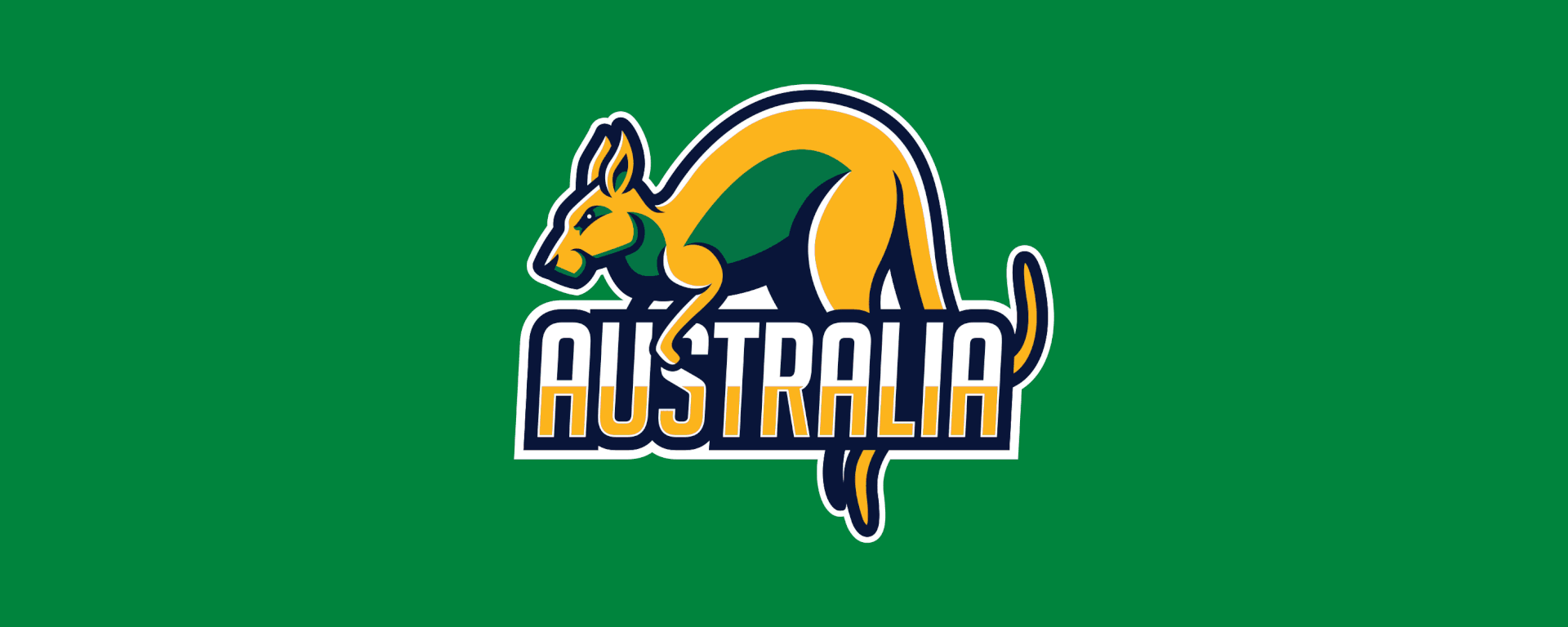
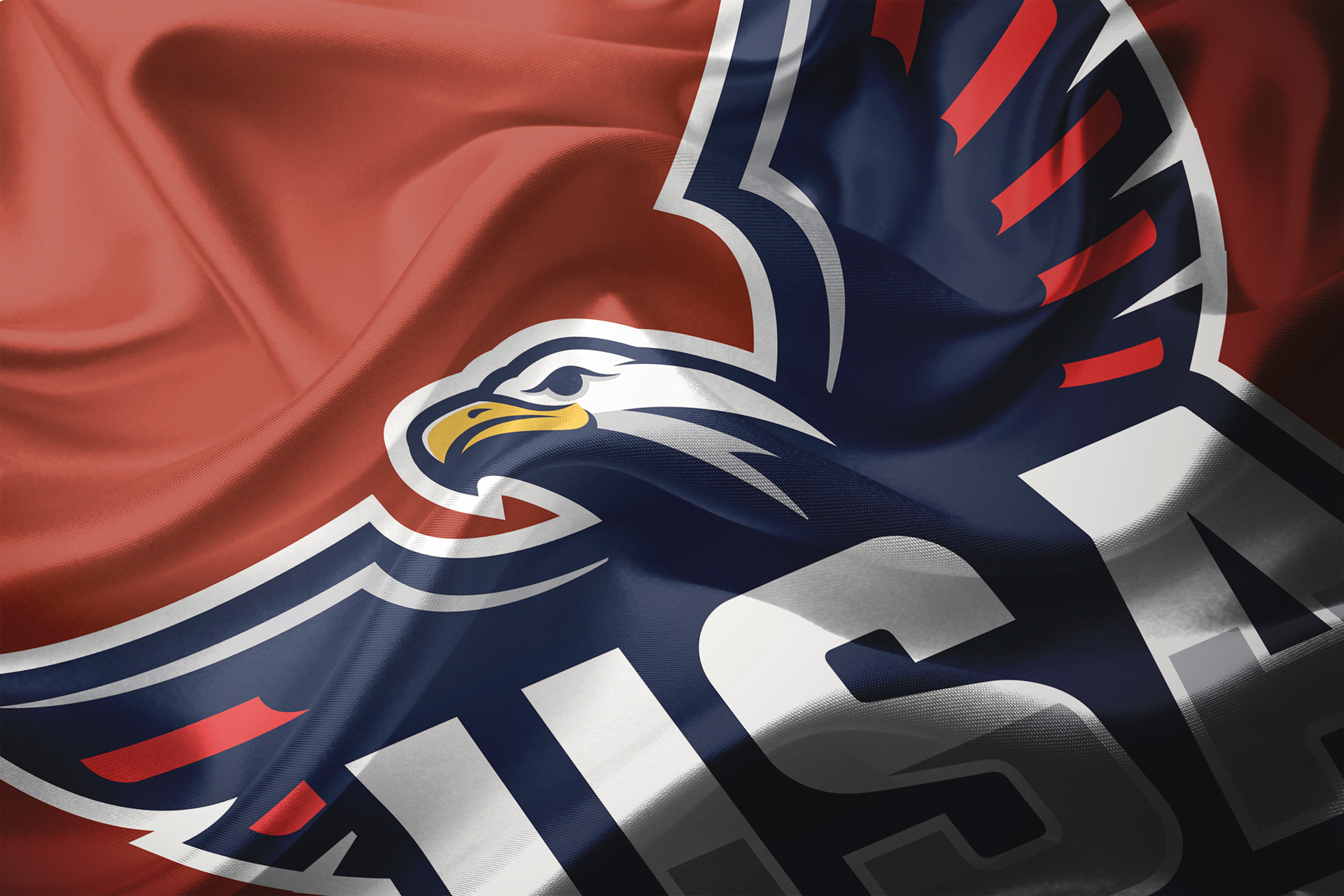
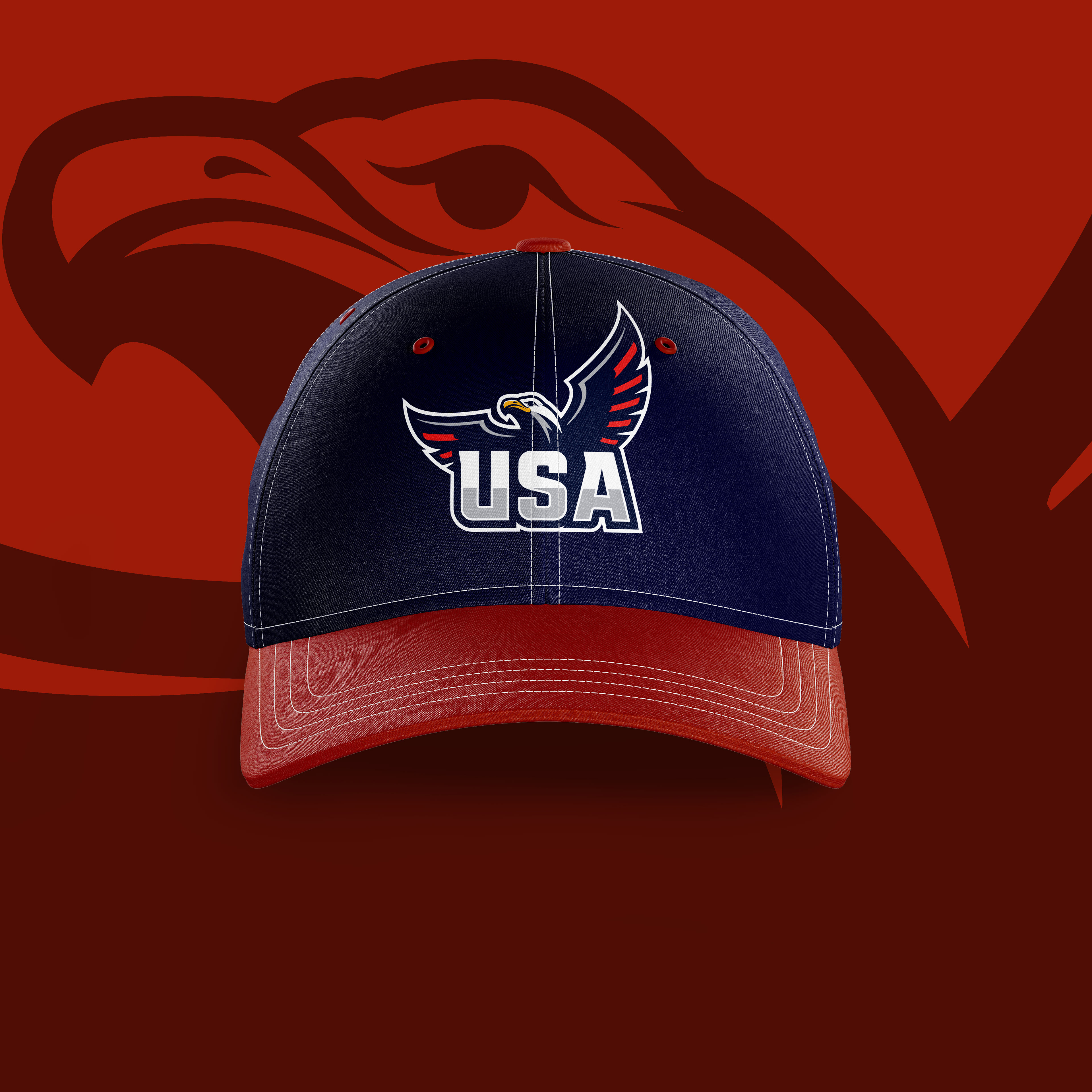
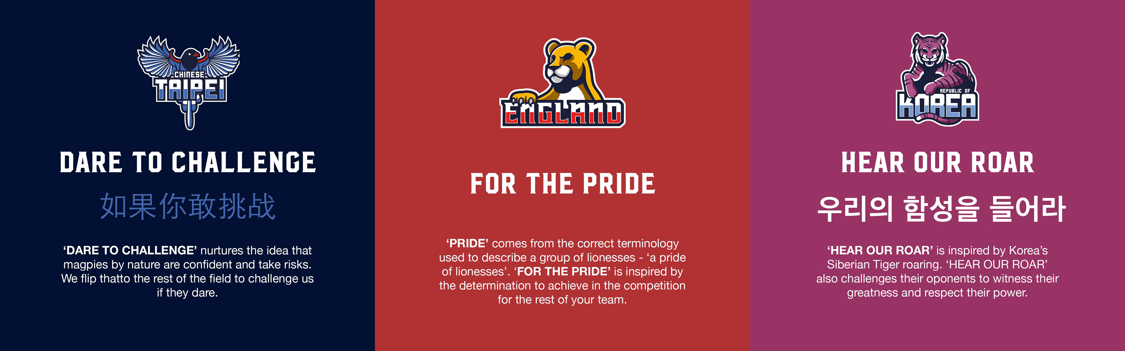
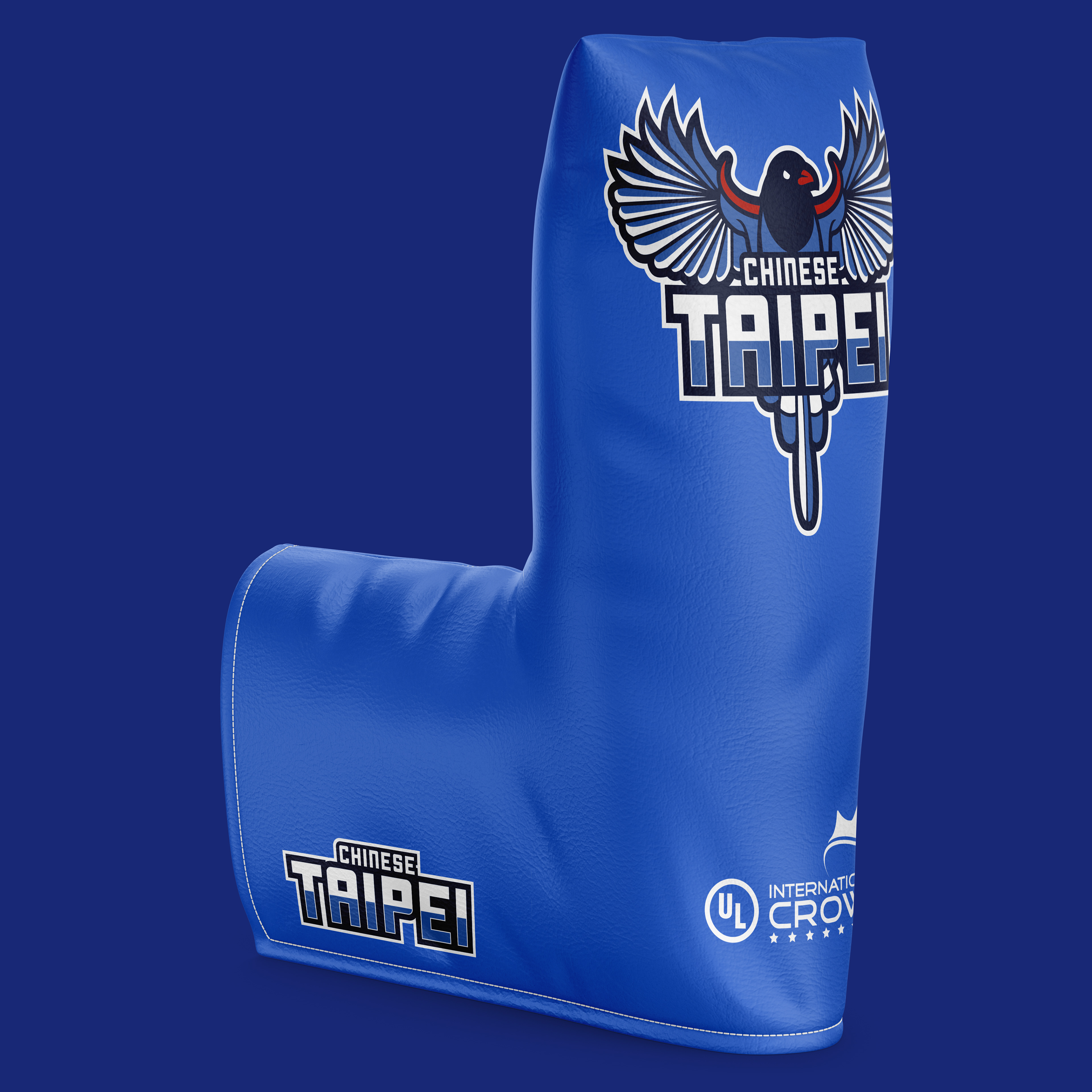
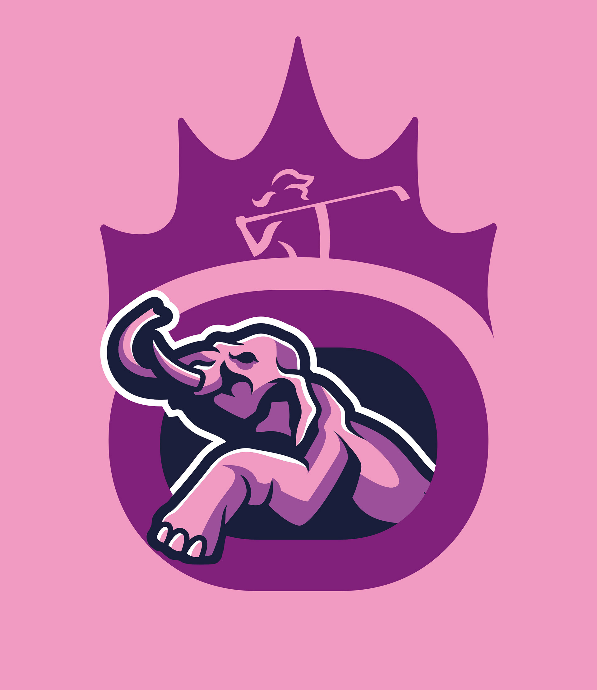
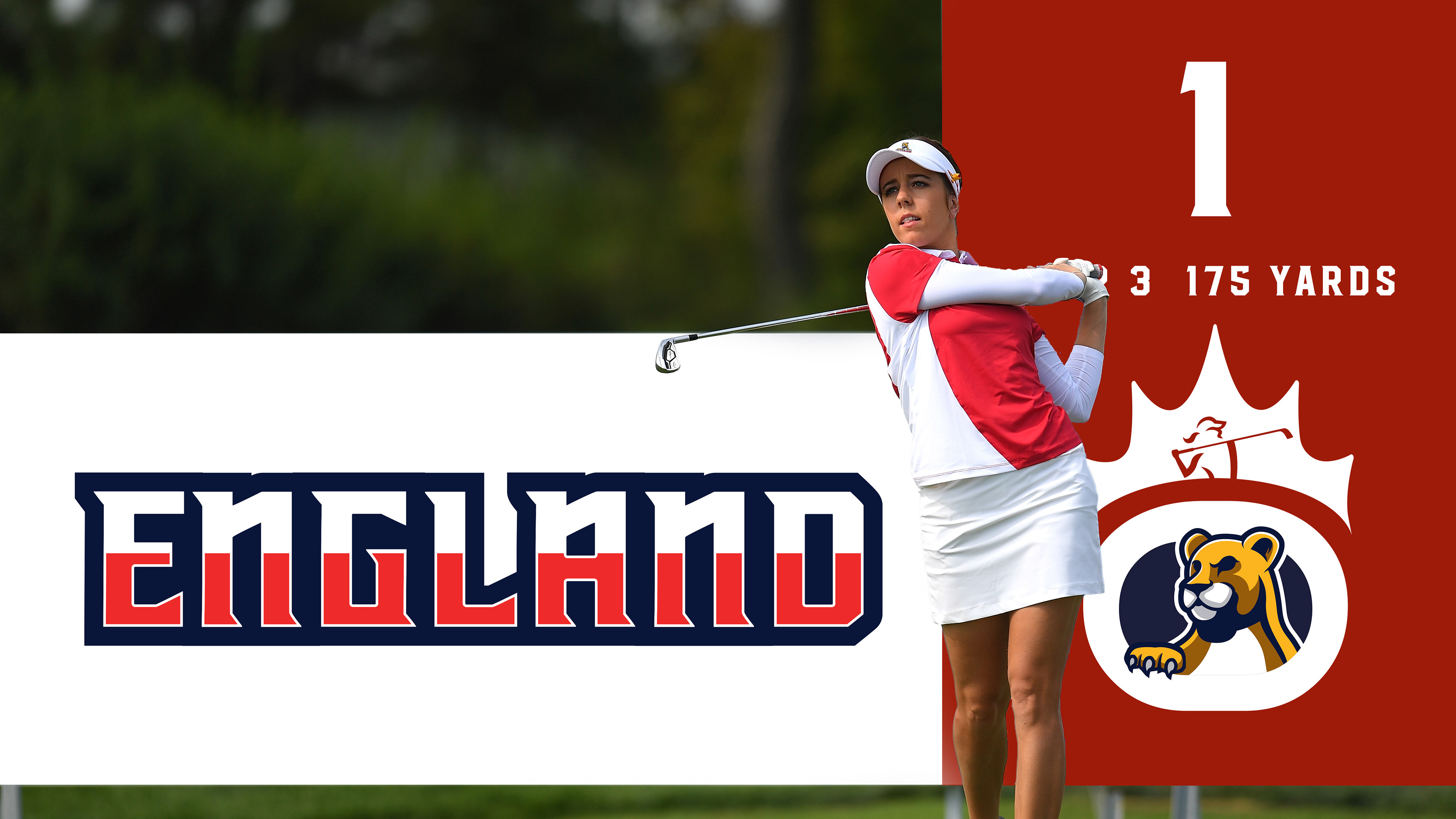
Representing your country is the biggest prize in any sport, the highest honour. In previous editions of the International Crown, the teams lacked a real identity both on and off the gold course. Our solution was to make the team feel more united but also create the look and feel that players and fans would be proud to wear. Each team emblem draws inspiration from their countries national animal whilst embracing their unique history and story.
Team Emblems
Previous editions of the International Crown lacked a real team identity both on and off the golf course. Our task, was to make the team feel more united but also create and look and feel that players and fans would be proud to wear. Each team emblem draws inspiration from their countries national animal whilst embracing their unique history and story.

Powerful Messaging
Each team has a unique rally cry that cleverly relates to each team's emblem whilst also
remaining culturally and golf relevant.
Unique Visual Identity
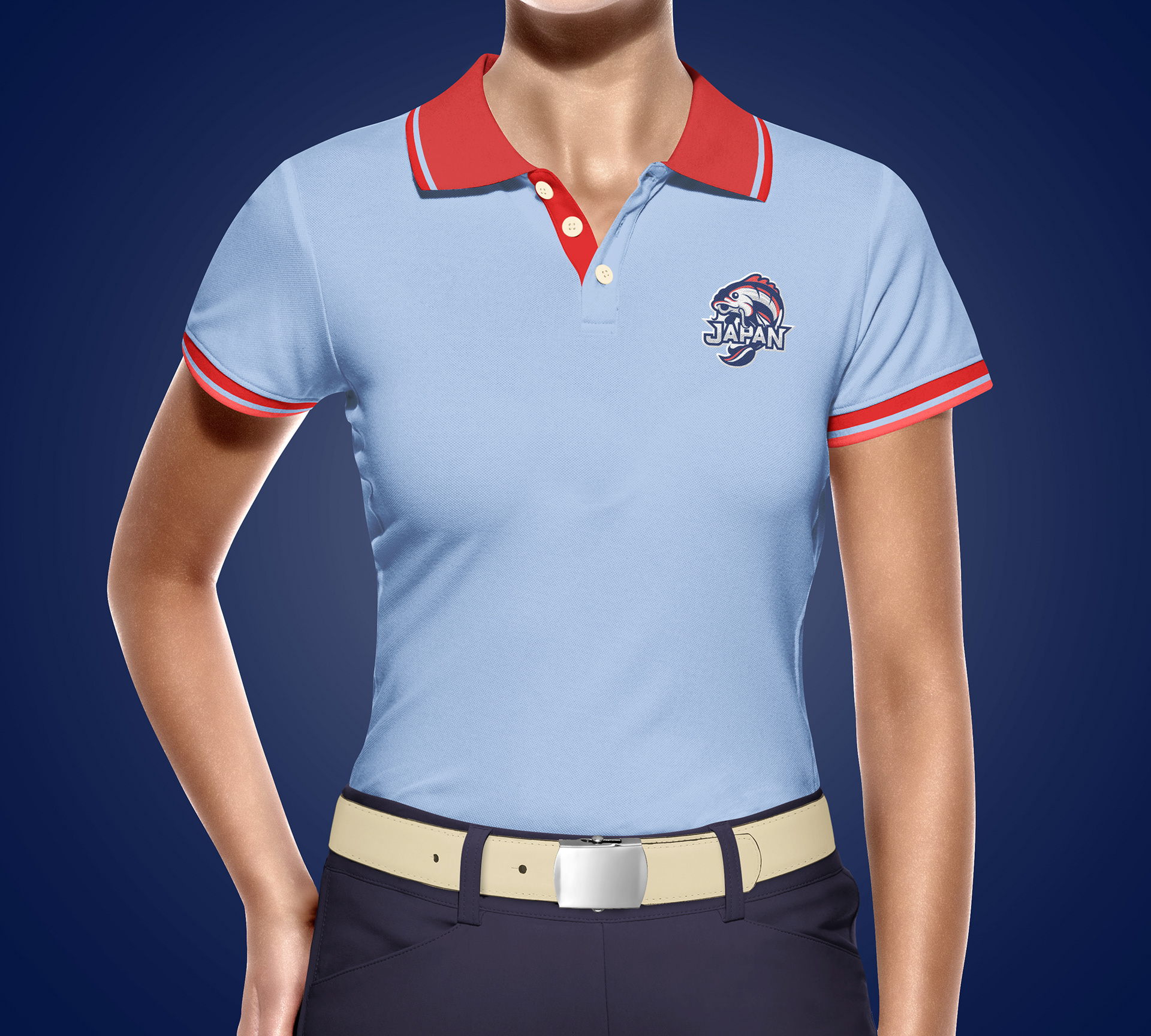
Team colours tend to be dictated by each individual nations flags. The issue with this is that numerous coutries have very similar colour palettes, and in team sports this can be a problem. We wanted to create a more unique look and style for each team, and although we didn't want to forget the power of a nation's flag we instead drew inspiration from local culture and landmarks to create a unified and vibrant colour palette for each team.

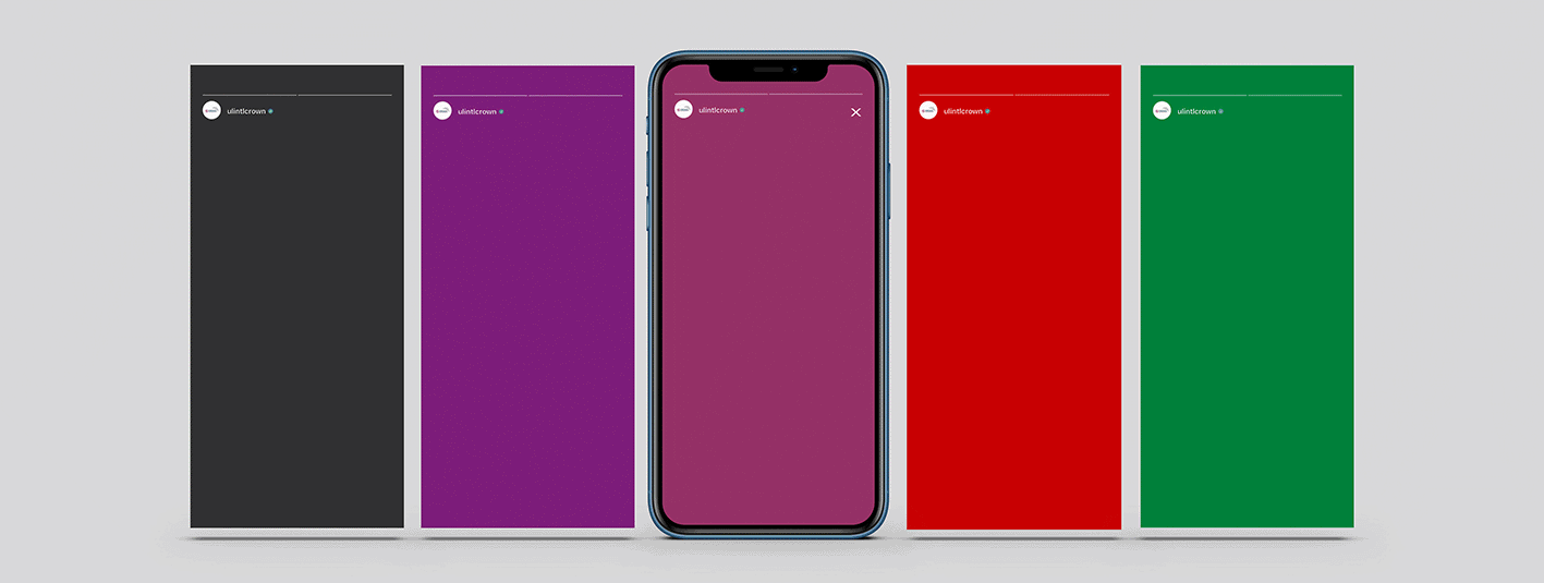
The emblem's were fully animated to create a new dynamic to the design. These were to be launched across social media and used across other digital platforms.
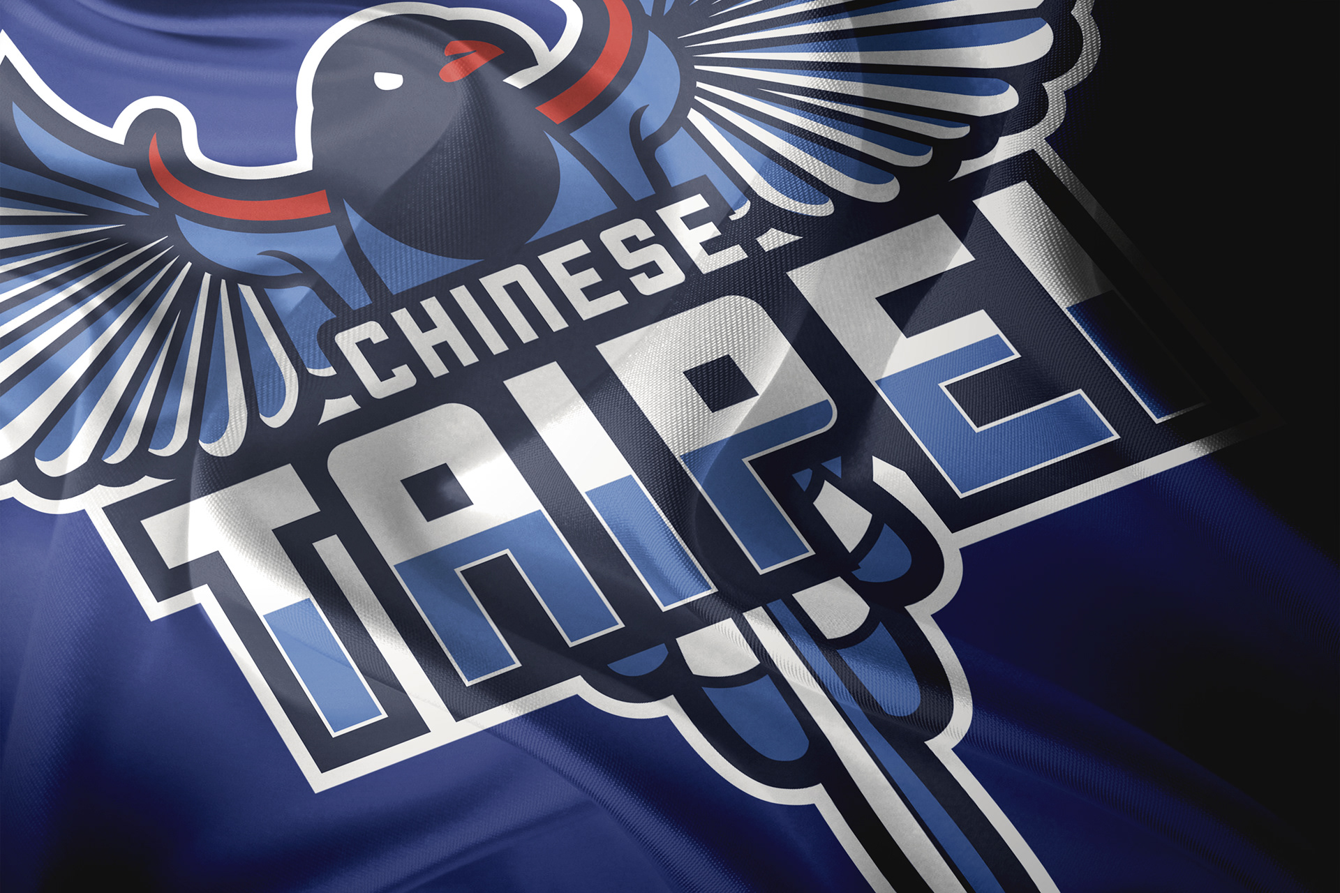
Working Within The Core Brand
We created a device which allows the emblems to be linked back to the event. We took the unique 'O' from the name as well as the crown icon to create a unique lockup that allows the emblems to be in sync with
the wider brand.


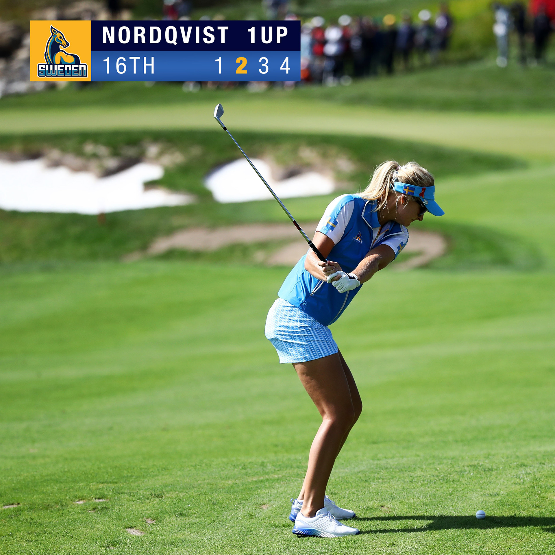
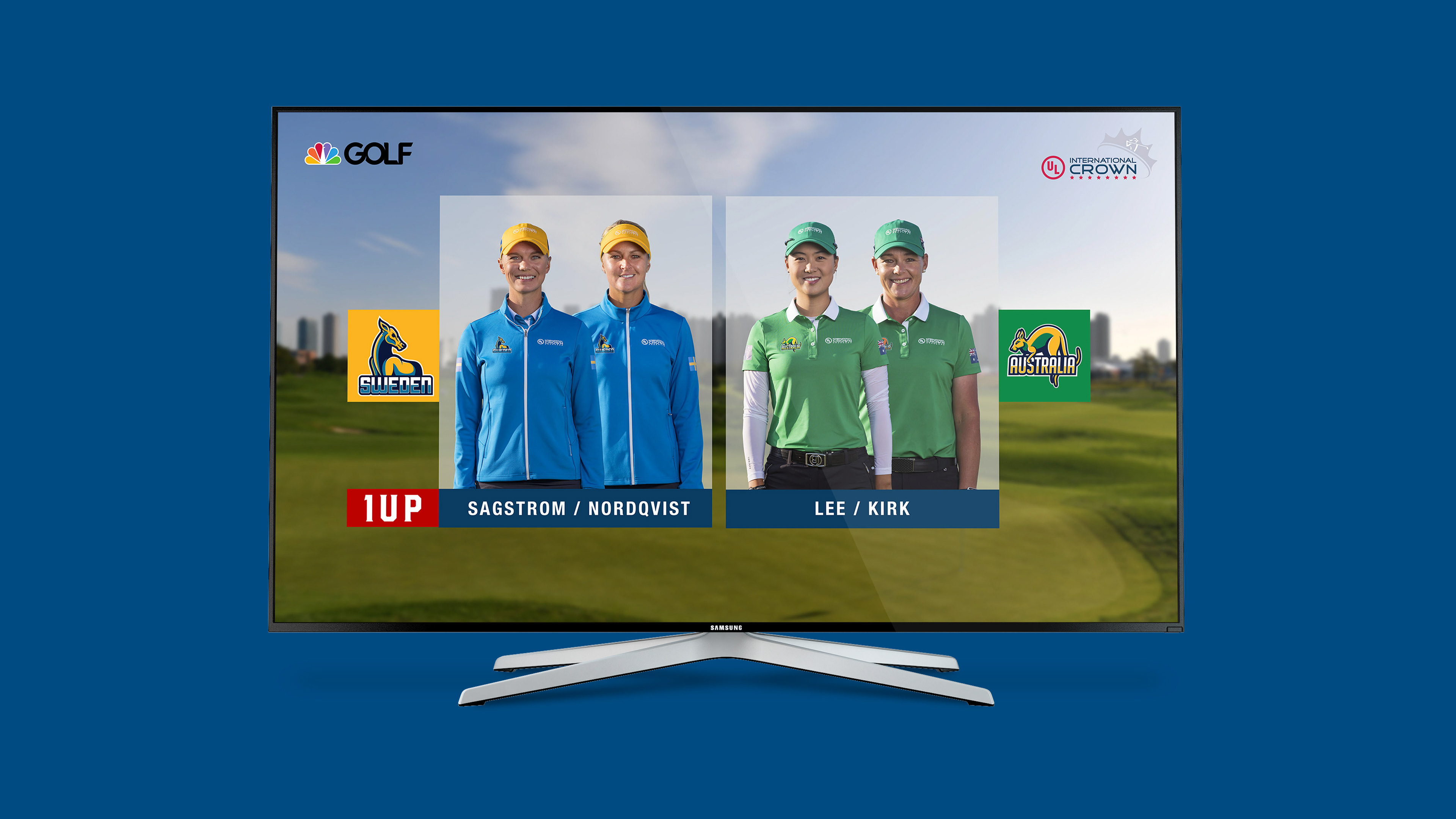
Designing For Screen
A full TV experience that brings a complex world of live data including league tables, charts, player profiles and in-round information together as a connected whole. It underpins the overall brand and enhances the game.

Home Advantage
In team sports, the home team tends to have a better advantage as they are playing in front of a more favourable crowd. We designed the branding with that in mind. As the event moves around the world the use of colour and the team emblems will make the host nation feel more at home.
Credits:
Creative direction, Art direction + Design: Ryan Gouge
Project Management: Joseph Hills
Illustration: Alex Tillbrook